Thursday, September 23, 2010
Why Companies Change their Logos
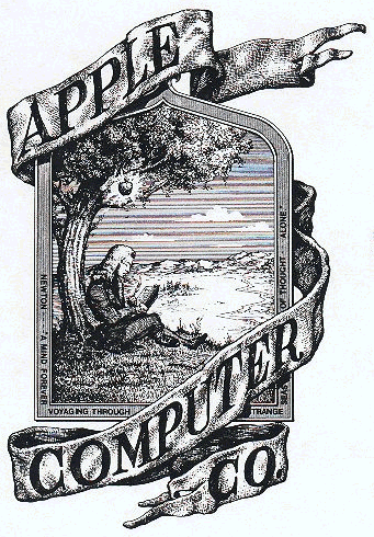
Most of the consumers today relate the one simple apple either gray or rainbow colored. However, the first apple logo was much more complicated and sophisticated than the current logo for the apple company. Do you think that it was necessary to change the logo? Marketing companies needed a logo that was simple and noticeable. The one they have now stands out, and everybody knows what it represents. However, if you take a look at the original apple logo (located below), there's too many things going on in the logo so a person can't concentrate. For marketing companies, the bold and simple logo is a better logo to use.
Subscribe to:
Post Comments (Atom)
No comments:
Post a Comment